Contents
Technology has enabled us to amass greater amounts of data, and there is an accompanying growing desire to make sense of all of this data. Let’s investigate how to tell data-driven stories that can be used to deliver better decision-making.
Importance of data storytelling
We’ve all fallen victim to bad slideware. Hit-and-run presentations confuse us with a whirlwind of typefaces, colors, and bullets while also emphasizing infographics that are not effective. There is a story in your data. But your tools don’t know what that story is. That’s where it takes you—the analyst or communicator of the information—to bring that story visually and contextually to life.
The ability to tell stories with data is becoming increasingly important in our world of increasing data and a desire for data-driven decision-making. Effective data visualization can mean the difference between success and failure when it comes to communicating your study, raising money for your nonprofit, presenting to the board, or simply getting the main points across to your audience.
How to tell a data-driven story
Data storytelling is like cooking a dish with many different types of raw ingredients. With big resources of data, the most important point is how to make the best use of information and turn it into something ‘delicious’. To effectively visualize data and tell insightful stories, there are some practical lessons and tips listed below:
Prepare for data storytelling
This may sound paradoxical, but success in data storytelling does not start with data visualization. Rather, before you begin down the journey of developing a data visualization or communication, attention and time should be paid to understanding the context for the need to communicate.
Understand the context
There are a few things to think about and be extremely clear before visualizing any data or creating content:
- How can you use data to help make your point? – How (There will be some tips on how to tell an insightful story and create actionable visual aids in the next section).
- To whom are you communicating? – Who (It is important to have a good understanding of who your audience is and how they perceive you)
- What do you want your audience to know or do? – What (You should consider how you will communicate with them. Another consideration is the overall tone you want to set out for).
Pro tips: The 3‐minute story, Big Idea & Storyboarding
One of the approaches to estimating the effectiveness of your data-driven story is that you can boil the “so‐what” down to a paragraph and, ultimately, to a single, concise statement. There are 3 concepts below to establish the “so-what” questions:
- 3‐minute story
The 3‐minute story is exactly that: if you had only three minutes to tell your audience what they needed to know, what would you say?
- Big Idea
The Big Idea can deliver the key points in a single sentence. According to the book “Resonate” (2010) by Nancy Duarte, the Big Idea has three criteria:
- Storyboarding
The storyboard establishes a structure for your communication. It is a visual outline of the content you plan to create. It can be subject to change as you work through the details, but establishing a structure early on will set you up for success.
After answering the three questions of Who, What, and How in your head, it’s time to embark on the journey of telling a data-driven story. When you see a great play, watch a captivating movie, or read a fantastic book, you’ve experienced the magic of story. Hence, telling stories with data is a powerful tool that you could leverage to communicate insights to audiences.

Act like an artist of data
Become a storyteller
This section will explore the magic of the story and how we can use concepts of storytelling to communicate effectively with data. We can use the structure of the beginning, middle, and end to set up the stories that we want to communicate with data. Let’s discuss each of these pieces and the specifics to consider when crafting your story.
The beginning
The first thing to do is introduce the plot, building the context for your audience. In this section, we set up the essential elements of the story—the setting, the main character, the unresolved state of affairs, and the desired outcome—getting everyone on a common ground so the story can proceed. We should involve our audience, evoking their interest and answering the questions that are likely on their mind: Why should I pay attention? What’s in it for me?
Based on the book “Beyond Bullet Points”, Cliff Atkinson outlines the following questions to consider and address when it comes to setting up the story:
- The setting: When and where does the story take place?
- The main character: Who is driving the action? (This should be framed in terms of your audience!)
- The imbalance: Why is it necessary, what has changed?
- The balance: What do you want to see happen?
- The solution: How will you bring about the changes?
Note the similarity between the questions above and those raised by McKee that we covered earlier.
Another way to trigger attention and interest in your communication is to frame it in terms of the problem and your recommended solution. As we’ve discussed, conflict and dramatic tension are critical components of a story. Nancy Duarte calls this tension “the conflict between what is and what could be.” There is always a story to tell. If it’s worth communicating, it’s worth spending the time necessary to frame your data in a story.
The middle
Once you’ve set the stage, so to speak, the bulk of your communication further develops “what could be,” with the goal of convincing your audience of the need for action. You’ll work to convince them why they should accept the solution you are proposing or act in the way you want them to.
The specific content will take different forms depending on your situation. The following are some ideas for content that might make sense to include as you build out your story and convince your audience to buy in:
• Further develop the situation or problem by covering the relevant background.
• Incorporate external context or comparison points.
• Give examples that illustrate the issue.
• Include data that demonstrates the problem.
• Articulate what will happen if no action is taken or no change is made.
• Discuss potential options for addressing the problem.
• Illustrate the benefits of your recommended solution.
• Make it clear to your audience why they are in a unique position to make a decision or drive action.
When considering what to include in your communication, keep the audience at the top of your mind. Think about what will resonate with them and motivate them.
For example: what incentives encourage your audiences? Will your audience be motivated to act by making money, beating the competition, gaining market share, saving a resource, eliminating excess, innovating, learning a skill, or something else?
Consider framing your tale and the need for action in terms of what inspires your audience. Additionally, consider whether and when statistics will enrich your tale and incorporate it as necessary.
The end
The narrative must come to a conclusion. End with a call to action: make it very obvious to your audience what you want them to do with the new insight or information you have given them.
One classic way to end a story is to tie it back to the beginning. At the beginning of the story, you developed the storyline and added dramatic tension. To wrap up, You can consider highlighting the issue and the resulting necessity for action. Rehashing any sense of urgency can also help to motivate your audience to take action.
The narrative structure, which we’ll cover next, is another crucial factor when it comes to the sequence and delivery of our story.
The narrative structure
A narrative needs to be at the heart of the message for it to be effective. These are words—written, spoken, or a combination of the two—that tell the story in a logical sequence and persuade the audience as to why it is significant or fascinating and warrants their attention.
A strong narrative can overcome less‐than‐ideal visuals. This is not to say that you shouldn’t spend time making your data visualizations and visual communications great, but rather to underscore the importance of a compelling and robust narrative.
Narrative flow: the order of your story
Think about the order in which you want your audience to experience your story:
- Are they a busy audience who will appreciate it if you lead with what you want from them? Or do you need to develop credibility with a new audience?
- Do they care about your method, or do they just need the solution? Do you need their input as part of a collaborative process?
- Do you want them to decide something or do anything? How do you get them to do what you want them to do the best?
The answers to these questions will help you determine what sort of narrative flow will work best, given your specific situation.
To do that, the important basic point here is that your story must have an order which is a collection of numbers and words on a given topic. This path should be clear to you. One way to order the story—the one that typically comes most naturally—is chronological. By way of example, if we think about the general analytical process, it looks something like this:
- Identify a problem
- Gather data to better understand the situation
- Analyze the data (look at it one way, look at it another way, tie in other things to see if they had an impact, etc.),
- Emerge with a finding or solution
- Have a recommended action
To approach the communication of this to your audience, you should take them along through it the same way you experienced it. This approach can work well if you need to establish credibility with your audience or if you know they care about the process. But chronological order is not your only option.
Tactics to help ensure that your story is clear
There are a number of concepts to ensure that the story you’re telling in your communication comes across. Most of these relate to a presentation deck. Let’s talk about four tactics to make your presentation’s story more understandable: horizontal logic, vertical logic, reverse storyboarding, and a fresh perspective.
Horizontal logic
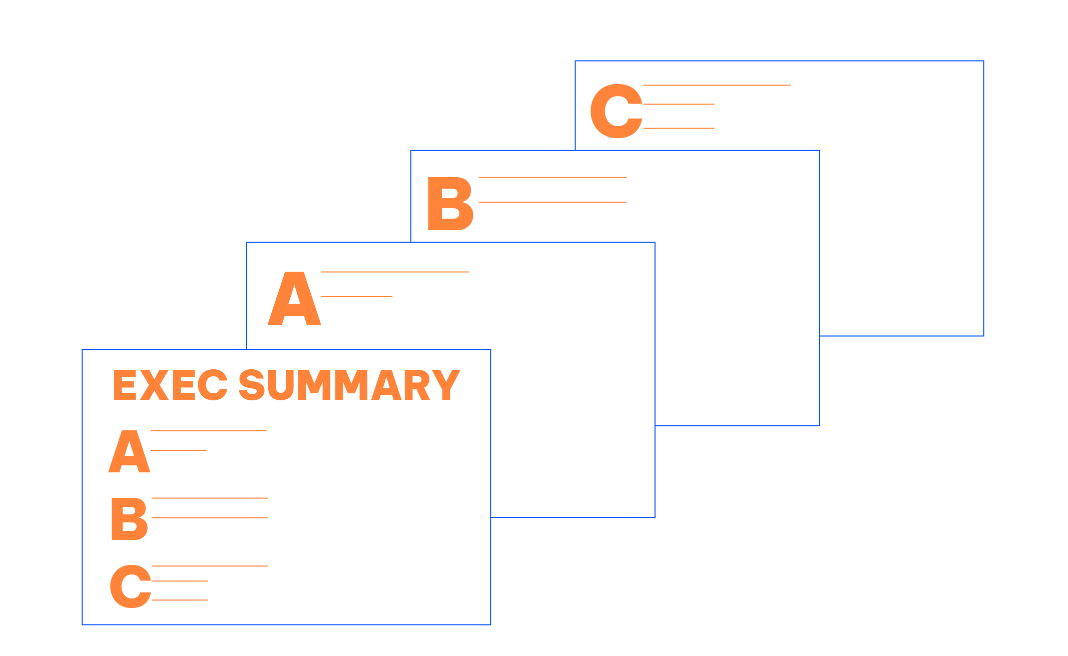
The idea behind horizontal logic is that you can read just the slide title of each slide throughout your deck, and together these snippets tell the overarching story you want to communicate. It is important to have action titles (not descriptive titles) for this to work well.
One strategy is to have an executive summary slide up front, with each bullet corresponding to a subsequent slide title in the same order (Figure 1). This is a nice way of setting it up, so your audience knows what to expect and then is taken through the detail.
Checking for horizontal logic is one of the approaches to evaluating whether your story is coming through clearly in your deck.
Vertical logic
Vertical logic means that all information on a given slide is self-reinforcing. The content reinforces the title, and vice versa. The words reinforce the visual and vice versa (Figure 2). The vertical logic method’s key point is to eliminate any unnecessary or unconnected information. Much of the time, the decision of what to remove or move to an appendix is just as crucial as the selection of what to keep.

Employing horizontal and vertical logic together will help ensure that the story you want to tell comes across clearly in your communication.
Reverse storyboarding
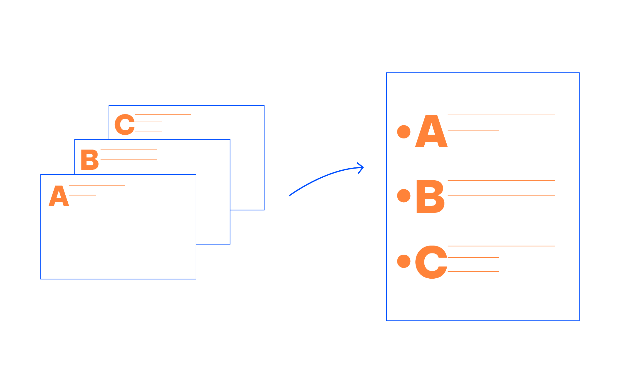
When you storyboard at the onset of building communication, you craft the outline of the story you intend to tell. As the name implies, reverse storyboarding does the opposite. You take the final communication, flip through it, and write down the main point from each page (it’s a nice way to test your horizontal logic as well).
The resulting list should look like the storyboard or outline for the story you want to tell (Figure 3). If it doesn’t, this can help you understand structurally where you might want to add, remove, or move pieces around to create the overall flow and structure for the story that you’re interested in conveying.
A fresh perspective
We’ve discussed the value of a fresh perspective to help you see through your audience’s lens when it comes to your data visualization. Seeking this sort of input for your overall presentation can be immensely helpful as well. Once you’ve crafted your communication, give it to a friend or colleague. It can be someone without any context.
Ask them to tell you what they pay attention to, what they think is essential, and where they have questions. This will help you understand whether the communication you’ve crafted is telling the story you mean to tell or, in the case where it isn’t, help you identify where to concentrate your iterations.
There is incredible value in getting a fresh perspective when it comes to communicating with data in general. As we become subject matter experts in our space, it becomes impossible for us to take a step back and look at what we’ve created through our audience’s eyes. But that doesn’t mean you can’t see what they see. Leverage a friend or colleague for their fresh perspective. Help ensure that your communication hits the mark.
Eliminate clutter (Visual aid)
Clutters are visual elements that take up space but don’t increase understanding. Soon, we’ll look more closely at the specific principles that could get rid of clutter, but in the meantime, it’s time to talk generally about the disadvantages of clutter. Perhaps without explicitly recognizing it, the presence of clutter in our visual communications can cause a less‐than‐ideal—or worse—uncomfortable user experience for our audience.
When our visuals seem complicated, we run the risk of our audience deciding they don’t want to take the time to understand what we’re showing. To prevent visual clutter, Gestalt principles help define how people interact with and create order out of visual stimuli.
Gestalt principles of visual perception
When it comes to identifying which elements in our visuals are signals (the information we want to communicate) and which might be noise (clutter), consider the Gestalt Principles of Visual Perception. It is are guidelines for how perceptual scenarios should be organized.
We’ll discuss six principles here: proximity, similarity, enclosure, closure, continuity, and connection. For each, I’ll show an example of the principle applied to a table or graph.
Proximity
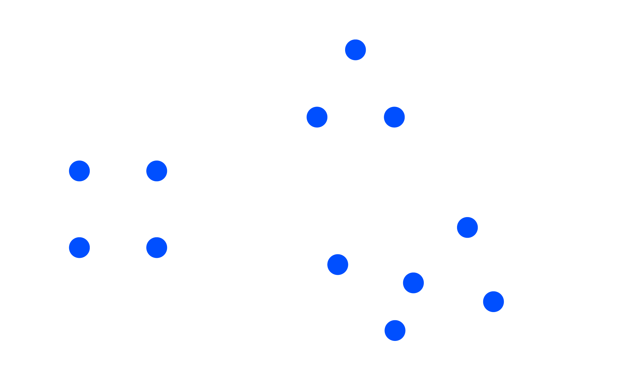
We tend to think of objects that are physically close together as belonging to part of a group. The proximity principle is demonstrated in Figure 4: you naturally see the dots as three distinct groups because of their relative proximity to each other.
We can leverage this way that people see in table design. In Figure 5, simply by virtue of differentiating the spacing between the dots, your eyes are drawn either down the columns in the first case or across the rows in the second case.

Similarity
Objects that are of similar color, shape, size, or orientation are perceived as related or belonging to part of a group. In Figure 6, you naturally associate the blue circles together on the left or the grey squares together on the right.
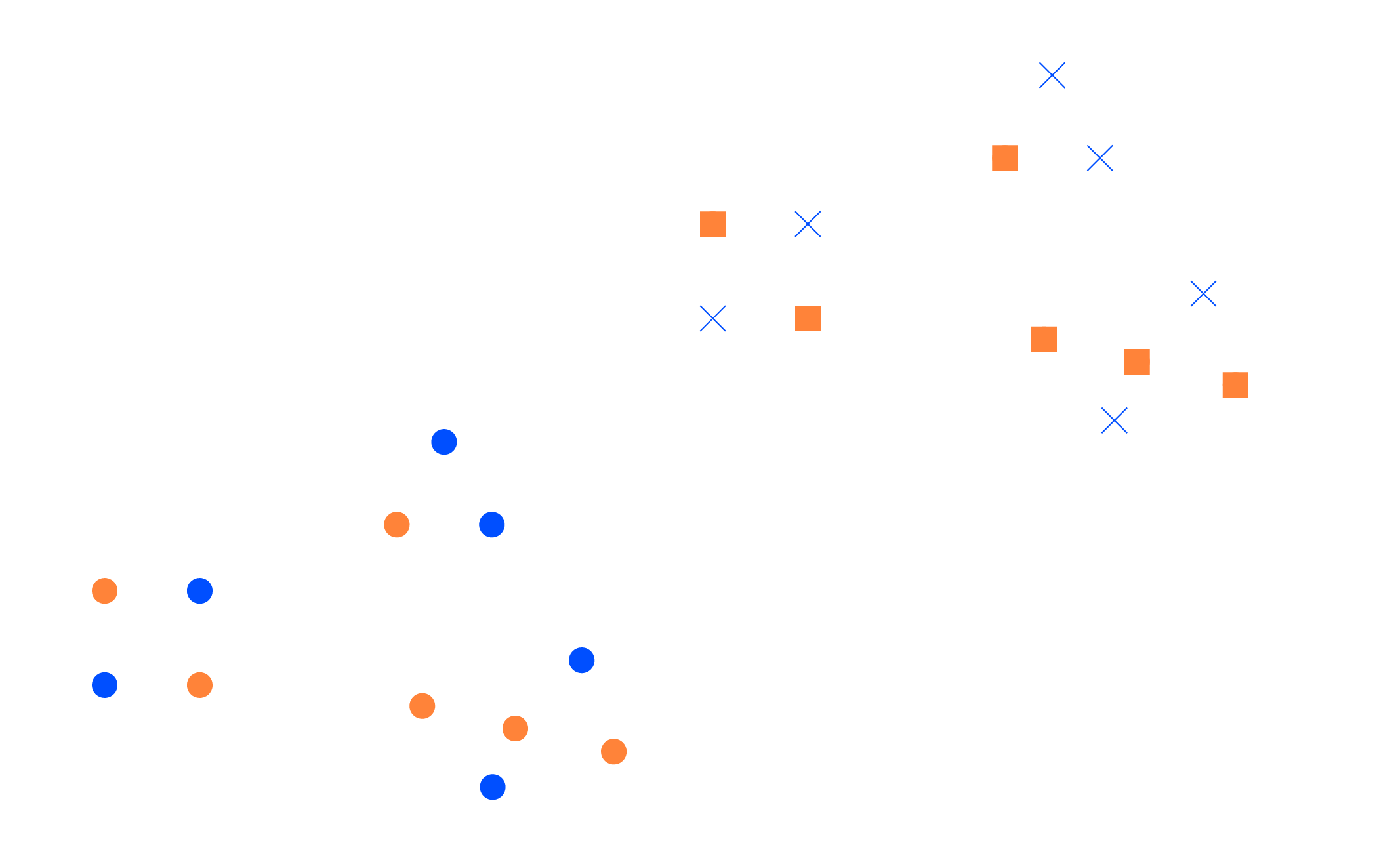
This can be leveraged in tables to help draw our audience’s eyes in the direction we want them to focus. In Figure 7, the similarity of color is a cue for our eyes to read across the rows (rather than down the columns). This eliminates the need for additional elements, such as borders, to help direct our attention.

Enclosure
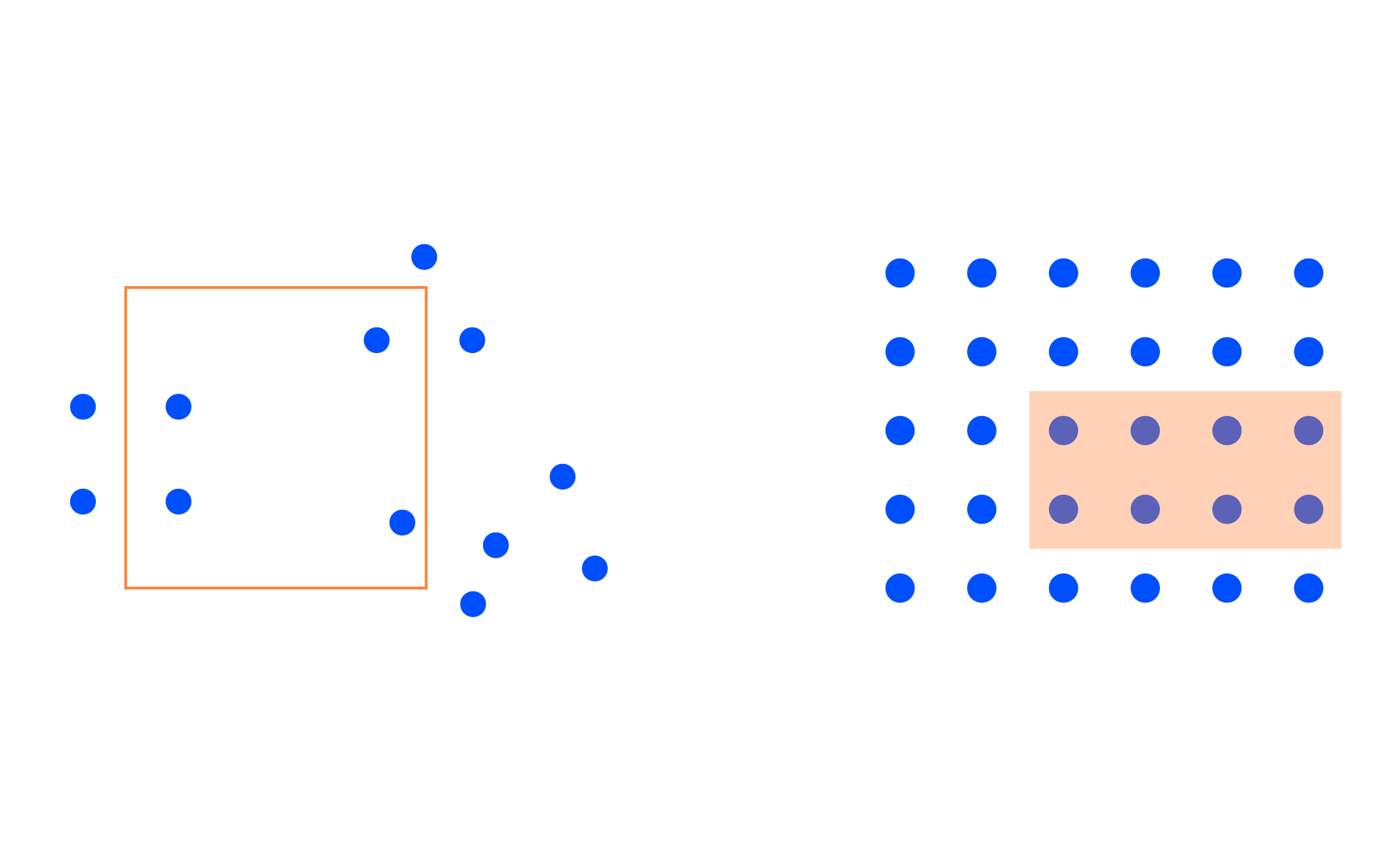
We think of objects that are physically enclosed together as belonging to part of a group. It doesn’t take a very strong enclosure to do this: light background shading is often enough, as demonstrated in Figure 8.
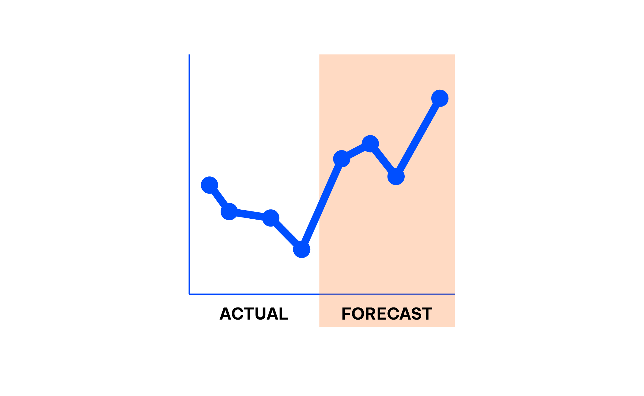
One way we can leverage the enclosure principle is to draw a visual distinction within our data, as is done in the graph in Figure 9. It illustrates that the shaded area separates the forecast from actual data.
Closure
The closure concept says that people like things to be simple and to fit into the constructs that are already in their heads. Because of this, people tend to perceive a set of individual elements as a single, recognizable shape when they can—when parts of a whole are missing, our eyes fill in the gap. For example, the elements in Figure 10 will be perceived as a circle and only after that as individual elements.

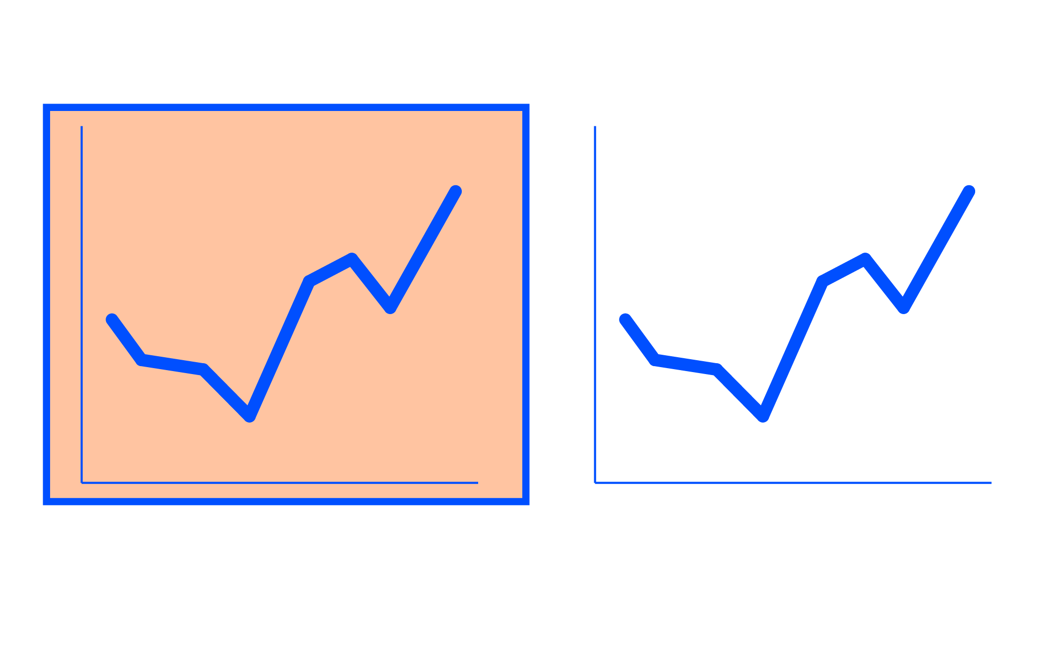
It is common for graphing applications (for example, Excel) to have default settings that include elements like chart borders and background shading. The closure principle tells us that these are unnecessary—we can remove them, and our graph still appears as a cohesive entity.
Bonus: when we take away those unnecessary elements, our data stand out more, as shown in Figure 11. The graph still works without the border and shading background.
Continuity
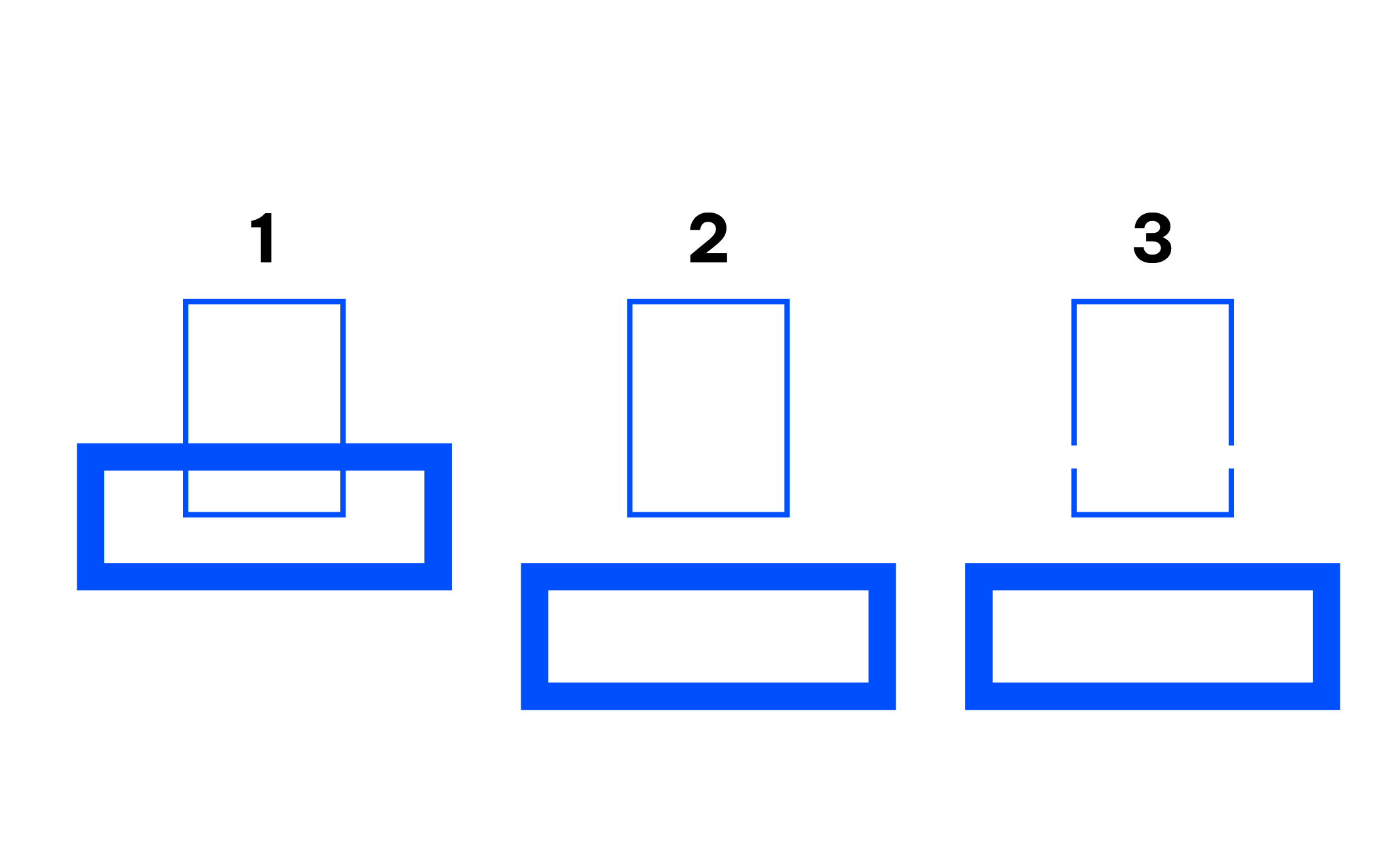
The principle of continuity is similar to that of closure: when looking at objects, our eyes seek the smoothest path and naturally create continuity in what we see, even where it may not explicitly exist. By way of example, in Figure 12, if I take the objects (1) and pull them apart, most people will expect to see what is shown next (2), whereas it could as easily be what is shown after that (3).
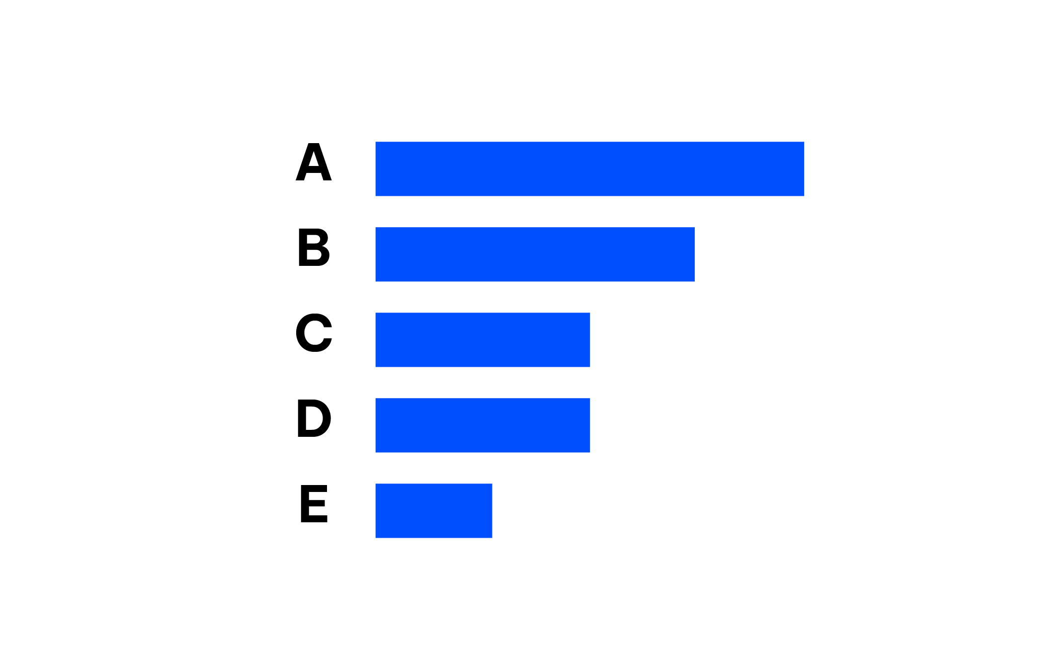
In the application of this principle, I’ve removed the vertical y‐axis line from the graph in Figure 13 altogether. Your eyes actually still see that the bars are lined up at the same point because of the consistent white space (the smoothest path) between the labels on the left and the data on the right. As we saw with the closure principle in the application, stripping away unnecessary elements allows our data to stand out more.
Connection
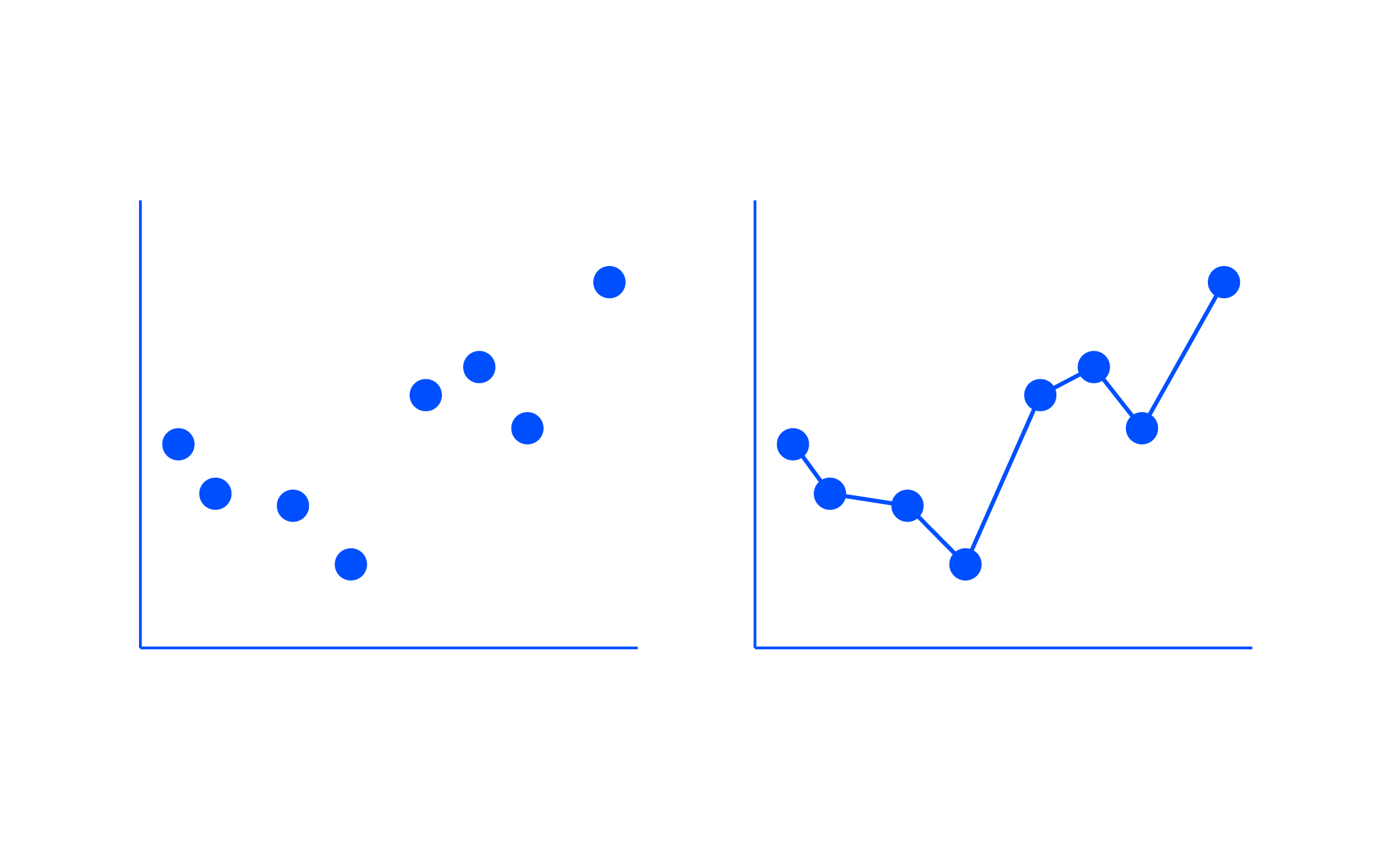
The final Gestalt principle we’ll focus on is connection. We tend to think of objects that are physically connected as being part of a group. The connective property typically has a stronger associative value than similar colors, sizes, or shapes. Note when looking at Figure 14, your eyes probably pair the shapes connected by lines (rather than similar color, size, or shape): that’s the connection principle in action.
The connective property isn’t typically stronger than enclosure, but you can impact this relationship through the thickness and darkness of lines to create the desired visual hierarchy.

One way that we frequently leverage the connection principle is in line graphs to help our eyes see the order in the data, as shown in Figure 15.
As you have learned from this brief overview, the Gestalt principles help us understand how people see, which we can use to identify unnecessary elements and ease the processing of our visual communications. We aren’t done with them yet.
communications, and how to recognize it; let’s look at a real-world example and examine how the process of identifying and removing clutter improves our visual and the clarity of the story that we’re ultimately trying to tell. I identified six major changes to reduce clutter. Let’s discuss each.
Conclusion
In this blog, we discussed some tips on where to start and strategies for upskilling storytelling along with data competency in your team and organization. However, there is no single ‘right’ answer for all, so one could approach data in varying ways. Reading the lessons we’ve conveyed is one thing, but how do you convert these knowledge into practical application? One of the simplest approaches is to look for opportunities in your work and practice more.
Unlock the power of data storytelling with GEM Corporation’s expert data services
With expert insights into a variety of data-related services, GEM will be your trusted assistant in the journey to achieve data-driven success with better decision-making and business intelligence.
Let GEM know how we can reach out to you via the form below!


